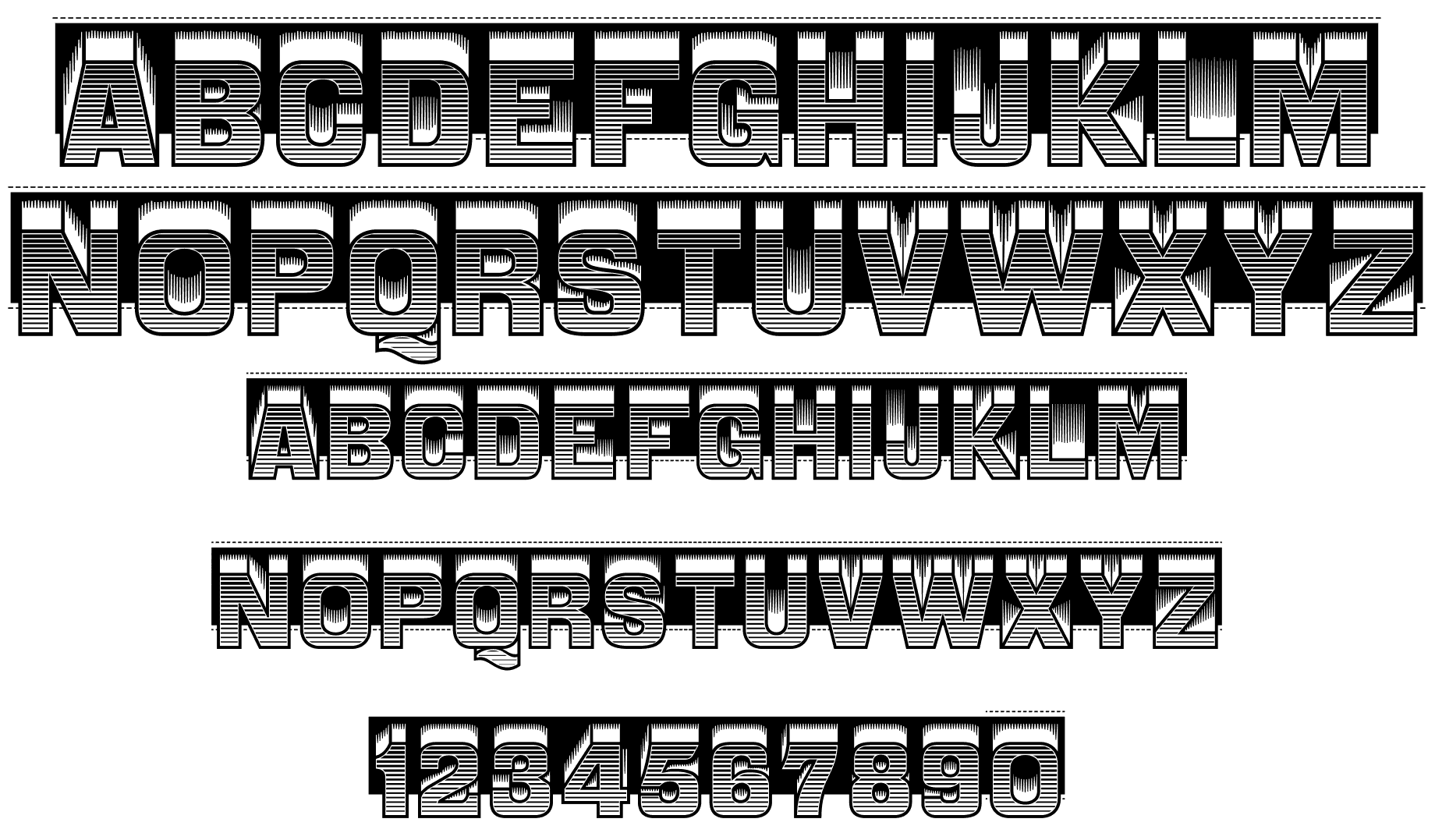
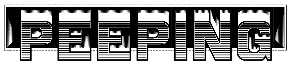
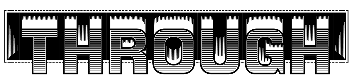
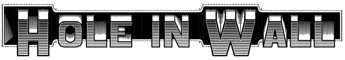
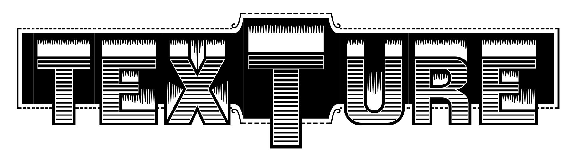
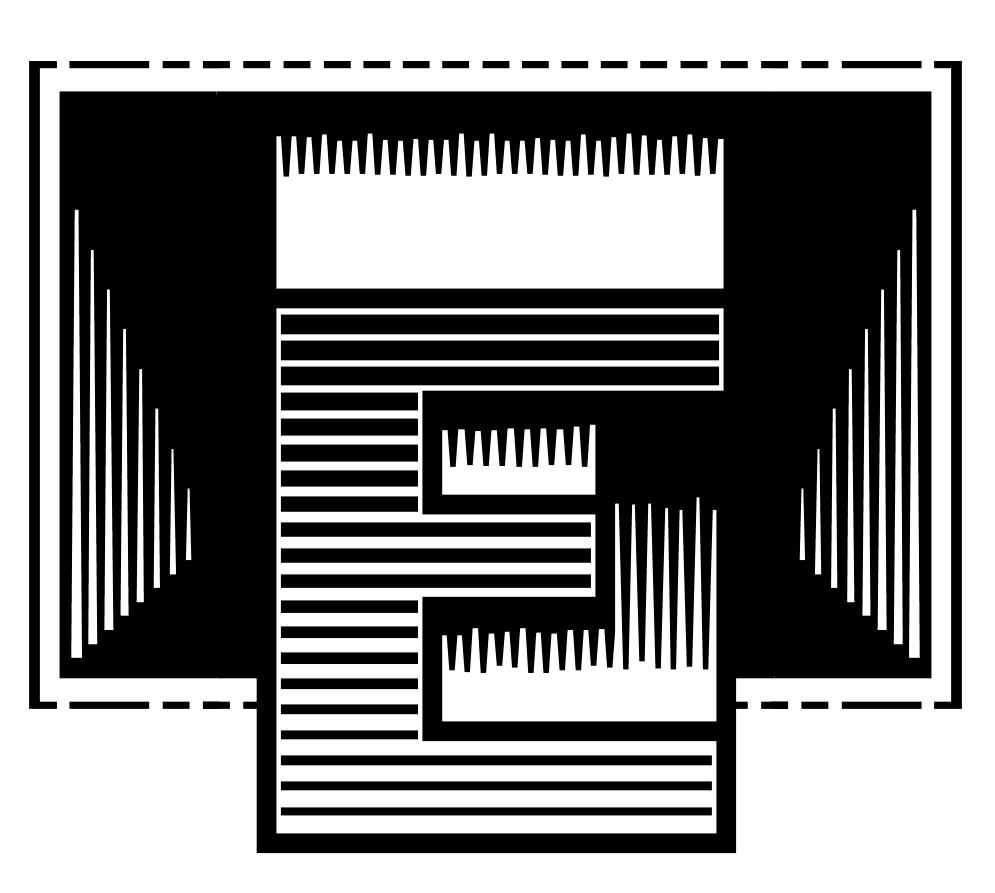
Relievo
A digital revival of the ‘Relievo’ typeface designed by Herman(n) Ihlenburg and patented in 1878.
Specimen books
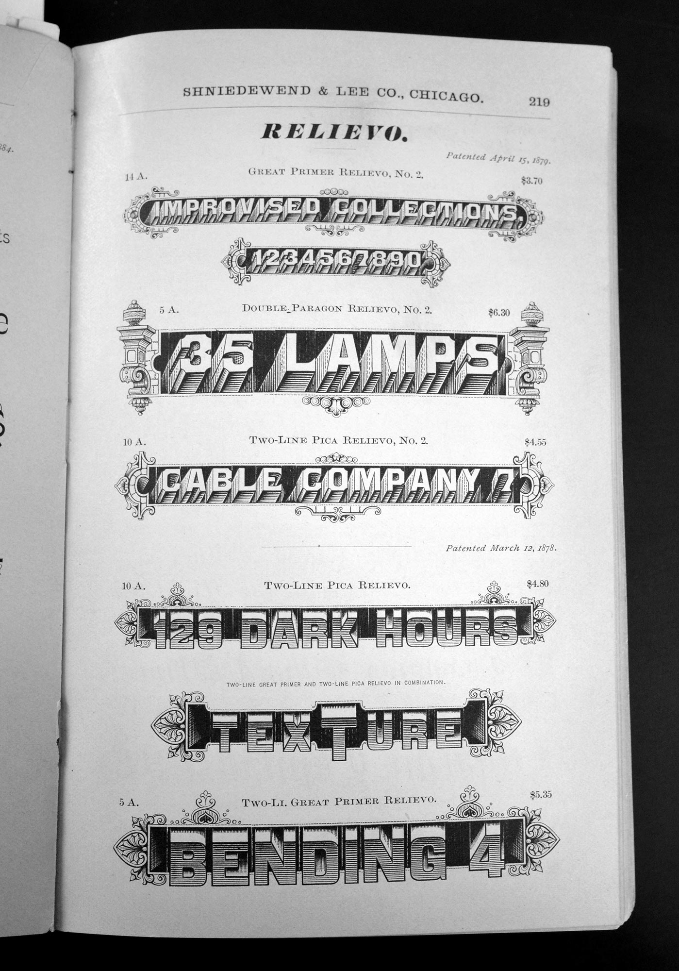
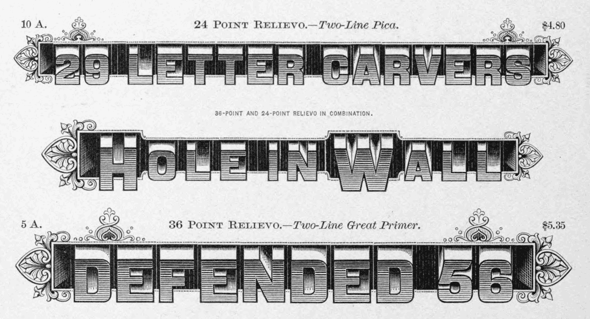
Quote of the patent
“The nature of my design is clearly shown in the accompanying typographic impression, to which reference is made; and consists of a letter which may be said to be composed of two parts: first, the letter form, consisting of an outline letter shaded upon its face by a series of short horizontal lines above each other, which lines are heavier as they approach the upper portions of the letter; second, above the upper horizontal, oblique, and curved lines of the letters are unshaded spaces, giving the appearance of a receding face to each letter. These unshaded spaces are bounded on one side by the boundaries of the letter form, and on the other by short, somewhat irregularly-notched, margins, formed by lines extending into them from a monotone background, from which the letters are projected.” Patent by Herman Ihlenburg
The digital version